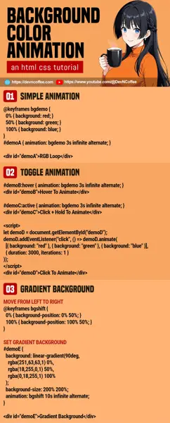
So you want to add some funky background colors to your project? There’s no need to load an entire library, just some simple CSS will do the magic. Let Master Coffee show you how, let’s go!
CODE DOWNLOAD
I have released this under the MIT license, feel free to use it in your own project – Personal or commercial. Some form of credits will be nice though. 🙂
VIDEO TUTORIAL
1) BASIC BACKGROUND COLOR ANIMATION
<div id="demoA" class="demo">
  Red Green Blue Loop
</div>@keyframes bgdemo {
0% { background: red; }
50% { background: green; }
100% { background: blue; }
}
#demoA { animation: bgdemo 3s infinite alternate; }This is as simple as it gets, the background color animation consists of “3 parts”:
- First, create the
<div>container as usual. - Then, define the
@keyframes. This is the color transition that you want, we will go with the “traditional” red-green-blue cycle in this example. - Attach the
@keyframesto the container withanimation: KEYFRAMES-NAME TIME LOOP DIRECTION. In this example:- A red-green-blue cycle will take 3 seconds.
- It will loop infinitely.
- It will loop in alternate directions. That is red-green-blue in the forward cycle, and blue-green-red in the reverse.
P.S. For the newbies who are lost, we can apply the animation to the entire page with html { animation: ... }.
2) TOGGLE BACKGROUND COLOR ANIMATION
2A) HOVER TO ANIMATE
<div id="demoB" class="demo">
  Hover To Animate
</div>#demoB:hover { animation: bgdemo 3s infinite alternate; }Don’t think this needs much explanation. If you want the animation to trigger only on mouse hover, use the :hover pseudo-class.
2B) CLICK & HOLD TO ANIMATE
<div id="demoC" class="demo">
  Click And Hold To Animate
</div>#demoC:active { animation: bgdemo 3s infinite alternate; }Once again, use the :active pseudo-class if you want the background animation to trigger only on mouse down.
P.S. Yes, mouse down. The animation stops when the mouse click is released.
2C) CLICK TO ANIMATE
<div id="demoD" class="demo">
  Click To Animate
</div>
<script>
let demoD = document.getElementById("demoD");
demoD.addEventListener("click", () => demoD.animate([
  { background: "red" },
  { background: "green" },
  { background: "blue" }
], {
  duration: 3000,
  iterations: 1,
  // iterations: Infinity
}));
</script>For some reason, there’s no such thing as “on click selector” in CSS… So the only proper way to implement animate on click is through Javascript. Beginners, keep calm and look carefully.
let demoD = document.getElementById("demoD")Get<div id="demoD">in Javascript.demoD.addEventListener("click", ...)When user clicks on<div id="demoD">.demoD.animate(KEYFRAMES, OPTIONS). Animate the background. Loop through red-green-blue, same old 3 seconds, but stop after 1 cycle.
3) GRADIENT BACKGROUND COLOR ANIMATION
<div id="demoE" class="demo">
  Gradient Background
</div>/* FROM TOP LEFT TO BOTTOM RIGHT */
@keyframes bgshift {
0% { background-position: 0% 0%; }
100% { background-position: 100% 100%; }
}
/* SET GRADIENT BACKGROUND */
#demoE {
background: linear-gradient(90deg, rgba(251,63,63,1) 0%, rgba(18,255,0,1) 50%, rgba(0,18,255,1) 100%);
background-size: 200% 200%;
animation: bgshift 10s infinite alternate;
}For those who wants “something better”, we can also animate a color gradient background.
background: linear-gradient(...)Start by creating a gradient background. You can use an online tool to help you create the gradient.background-size: 200%Make the background larger than its container.@keyframes bgshiftCreate a set of keyframes to move the background. In this example, we will simply shift from top left to bottom right.animation: bgshiftAttach the keyframes to the container.
TLDR – We shift a gradient background to create an illusion of changing colors.
THE END – PLAN YOUR COLORS
That’s all for this short tutorial and sharing. A coloful background is sometimes fun to watch, but be careful with the colors. A flashing background can be annoying. A background color that clashes with the text is even worse. So before you go crazy with making rainbows, make sure that your selected colors remain legible and comfortable.
CHEAT SHEET

