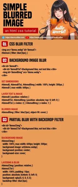
Once upon a time, a student wanted to create a blurred image. She then downloaded some photo editing software and created a “permanently blurred image” with it. Well, Master Coffee commend her efforts, but there is a much easier way with CSS – filter: blur(N px). Yep, let Master Coffee show you how, let’s go.
CODE DOWNLOAD
I have released this under the MIT license, feel free to use it in your own project – Personal or commercial. Some form of credits will be nice though. 🙂
VIDEO TUTORIAL
EXAMPLE 1) CSS BLUR FILTER
<style>
/* (PART A) BLUR FILTER */
#demoA1 { filter: blur(3px); }
#demoA2 { filter: blur(5px); }
</style>

<img src="demo.webp" id="demoA1">
<img src="demo.webp" id="demoA2">

As in the introduction, all we need is to apply CSS blur with filter: blur(N px). Control the “level of blur” with N px.
EXAMPLE 2) BLURRED BACKGROUND IMAGE
<style>
/* (PART A) DIMENSIONS */
#demoB, #demoBTxt, #demoBImg { width: 100%; height: 300px; }
#demoB { max-width: 600px; }

/* (PART B) TEXT ABOVE & IMAGE BELOW */
#demoB { position: relative; }
#demoBTxt, #demoBImg { position: absolute; top: 0; left: 0; }
#demoBTxt { z-index: 2; }
#demoBImg { z-index: 1; }

/* (PART C) IMAGE BLUR */
#demoBImg { filter: blur(3px); object-fit: cover; }
</style>

<div id="demoB">
  <div id="demoBTxt">Background blur, not text blur.</div>
  <img id="demoBImg" src="demo.webp">
</div>
If you want to “blur the background image only”, there’s somehow no way to do it directly at the time of writing… We will have to deal with this in a roundabout manner.
- Create a
<div id="demoB">container, place the text<div id="demoBTxt">and image<img id="demoBImg">inside. - To “stack” the text and image:
- Set the container to
#demoB { position: relative; }. - Set both text and image to
#demoBTxt, #demoBImg { position: absolute; } - Text on top
z-index: 2, and image belowz-index: 1.
- Set the container to
- Lastly, blur the image as usual with
filter: blur(3px).
EXAMPLE 3) BACKDROP FILTER BLUR
<style>
/* (PART A) BACKGROUND IMAGE */
#demoCImg {
  width: 100%; max-width: 600px; height: 300px;
  background-image: url(demo.webp);
  background-position: center;
  background-size: cover;
}

/* (PART B) LAYERING & BLUR */
#demoCTxt {
  width: 100%; height: 100%;
  background: rgba(0, 0, 0, 0.3);
  backdrop-filter: blur(3px);
}
<style>

<div id="demoCImg">
  <div id="demoCTxt">Background blur, not text blur.</div>
</div>This is an alternate way to create a blurred background image.
- We will use the
<div id="demoCImg">container to create the background image, only insert a single block of text<div id="demoCTxt">inside. - Set the background image on the container using
background-image(), control the placement usingbackground-positionandbackground-size. - Set the dimensions of the container as usual –
width height max-width max-height. - Set the text layer to fill up the container with
width: 100%andheight: 100%. - Lastly, set a transparent background color
background: rgba(...)and set a blurred backgroundbackdrop-filter: blur(...).
EXAMPLE 4) PARTIAL BLUR
<style>
/* (PART A) BACKGROUND IMAGE */
#demoDImg {
  width: 100%; max-width: 600px; height: 300px;
  background-image: url(demo.webp);
  background-position: center;
  background-size: cover;
}

/* (PART B) LAYERING & BLUR */
#demoDImg { position: relative; }
#demoDTxt {
  width: 100%; padding: 10px;
  position: absolute; bottom: 0; left: 0;
  background: rgba(0, 0, 0, 0.3);
  backdrop-filter: blur(3px);
}
</style>

<div id="demoDImg">
  <div id="demoDTxt">Background blur, not text blur.</div>
</div>The good part about using backdrop-filter blur and layering – We can control where to place the text layer, and effectively blur only a part of the image.
THE END – DON’T OVERDO IT
That’s all for this short tutorial and sharing. Adding a CSS blur filter is easy, but don’t overdo it. After all, the blur effect will be rendered by the user’s device on the fly. Top it up with all kinds of funky effects, you will get a digustingly slow page. So yep, be smart about it. A couple of blur effect may look nice, but too much spoils the entire experience.
CHEAT SHEET

