Once upon a time, a student wanted to customize a checkbox… Only to realize that there are no direct CSS properties to customize a checkbox/radio button. Well, we can still customize them, but it requires some “roundabout creativity”. Let Master Coffee walk you through a simple example, let’s go.
CODE DOWNLOAD
I have released this under the MIT license, feel free to use it in your own project – Personal or commercial. Some form of credits will be nice though. 🙂
VIDEO TUTORIAL
CUSTOM CHECKBOX & RADIO BUTTON DEMO
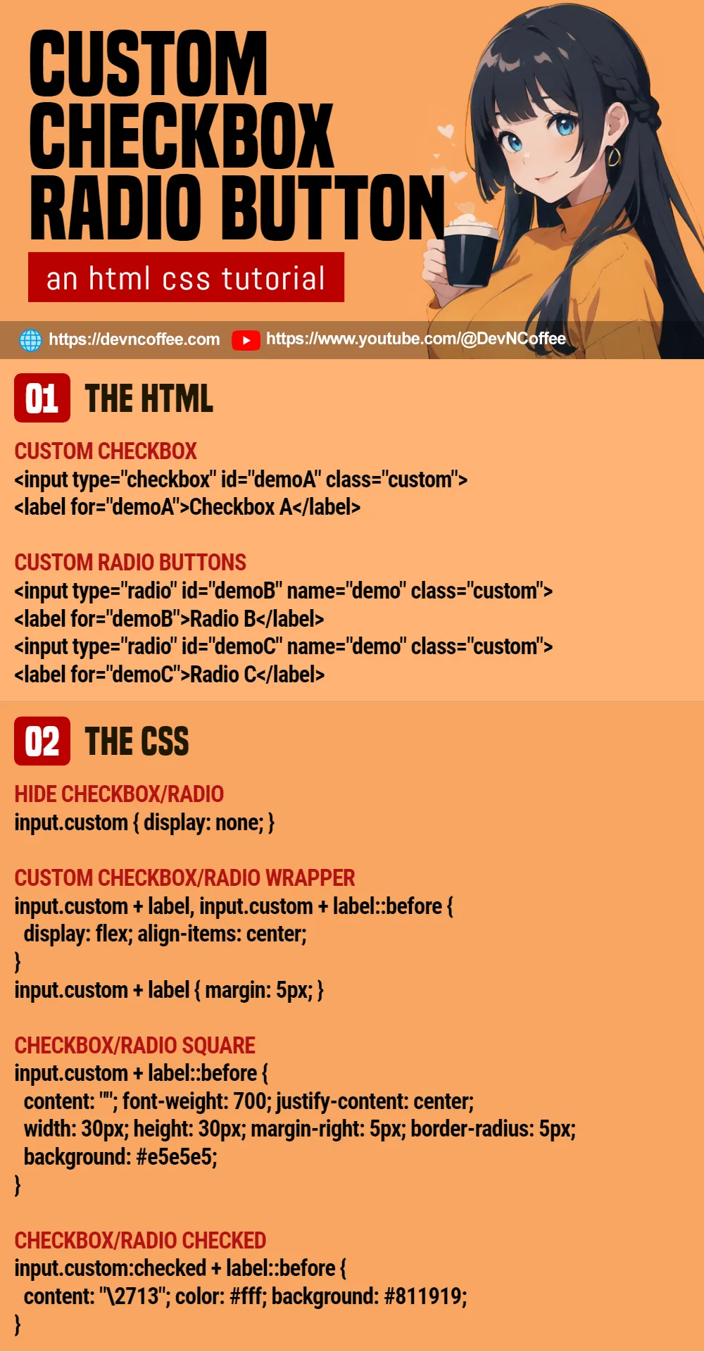
1) THE HTML
<!-- (PART A) CUSTOM CHECKBOX -->
<input type="checkbox" id="demoA" class="custom">
<label for="demoA">Checkbox A</label>

<!-- (PART B) CUSTOM RADIO BUTTONS -->
<input type="radio" id="demoB" name="demo" class="custom">
<label for="demoB">Radio B</label>
<input type="radio" id="demoC" name="demo" class="custom">
<label for="demoC">Radio C</label>
There is “nothing special” about the HTML, just the “usual” checkbox-label pair. But take note, the label must be inserted after the checkbox/radio button.
2) THE CSS
/* (PART A) HIDE CHECKBOX/RADIO */
input.custom { display: none; }

/* (PART B) CUSTOM CHECKBOX/RADIO WRAPPER */
input.custom + label, input.custom + label::before {
  display: flex;
  align-items: center;
}
input.custom + label { margin: 5px; }

/* (PART C) CHECKBOX/RADIO SQUARE */
input.custom + label::before {
  content: ""; font-weight: 700; justify-content: center;
  width: 30px; height: 30px;
  margin-right: 5px; border-radius: 5px;
  background: #e5e5e5;
}

/* (PART D) CHECKBOX/RADIO CHECKED */
input.custom:checked + label::before {
  content: "\2713";
  color: #fff; background: #811919;
}

/* (PART X) WHOLE PAGE */
* {
  font-family: Arial, Helvetica, sans-serif;
  box-sizing: border-box;
}
Beginners, keep calm and drink coffee. The main mechanics are:
- (A) We hide the default checkbox/radio button, they will still work when we click on the label.
- (B & C) Use the before pseudo-class of the label to draw the “custom square box”. If you prefer a circle, use
border-radius: 50%instead. - (D) When the checkbox/radio button is checked, we insert a checkmark with
content: "\2713"and change the color of the “custom square box” accordingly.
That’s all, feel free to change the colors and sizes as you see fit. You can even change the checkmark, just set the respective HTML symbol code into content: "\CODE".
EXTRA) LINE UP THE CHECKBOXES & RADIO BUTTONS
<!-- (PART A) INLINE CHECKBOXES -->
<div style="display: inline-block;">
  <input type="checkbox" id="demoA" class="custom">
  <label for="demoA">Checkbox</label>
</div>
<div style="display: inline-block;">
  <input type="checkbox" id="demoB" class="custom">
  <label for="demoB">Checkbox</label>
</div>

<!-- (PART B) FLEX CONTAINER -->
<div style="display: flex; flex-wrap: wrap;">
  <input type="checkbox" id="demoC" class="custom">
  <label for="demoC">Checkbox</label>
  <input type="checkbox" id="demoD" class="custom">
  <label for="demoD">Checkbox</label>
</div>
A small extra for those who want to “display the custom checkboxes/radio buttons in a single line”, you can either:
- Wrap each checkbox/label pair in an inline-block container.
- Or just throw everything into a flex container.
THE END – HOW ABOUT FORM SUBMISSION?
That’s all for this short tutorial and sharing. One last bit for the lost ones – We only changed the cosmetics, the custom checkboxes and radio buttons are still “regular checkboxes and radio buttons”. We do not need to do “anything special”, just submit the form as it is.
CHEAT SHEET