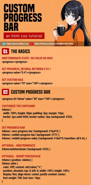
Once upon a time, a student is tasked to create a custom progress bar. She confidently said “just use the native HTML <progress>“… But after a few minutes, she raised the white flag of surrender. Just how do we customize the HTML progress bar? Let’s walk through a simple example.
CODE DOWNLOAD
I have released this under the MIT license, feel free to use it in your own project – Personal or commercial. Some form of credits will be nice though. 🙂
VIDEO TUTORIAL
1) BASIC HTML PROGRESS BAR
<!-- (PART A) INDETERMINATE -->
<progress></progress>

<!-- (PART B) VALUE MUST BE 0 TO 1 -->
<progress value="0.4"></progress>

<!-- (PART C) CUSTOM MAX -->
<progress value="70" max="100"></progress>
Yes, a progress bar is as simple as using the native <progress>. Just a quick walkthrough for the lazy ones who skipped the basics:
- When no value and maximum is set, the progress bar will be in an
indeterminatestate. - We can “move” the progress bar by setting the
value. By default, this is a decimal from 0 to 1. - We can override the
maxvalue.
2) CUSTOM PROGRESS BAR
2A) THE HTML
<!-- (PART A) CUSTOM PROGRESS BAR -->
<progress id="demoA" value="70" max="100"></progress>

<!-- (PART B) SET VALUE -->
<script>
function setDemo () {
  document.getElementById("demoA").value = document.getElementById("demoB").value;
}
</script>
<input id="demoB" type="range" min="0" max="100" onchange="setDemo()">
- Yep, still using the native
<progress>. The customization is solely done in the CSS. - Another quick one of the beginners, we can set the
valuein Javascript to move the progress bar as well.
2B) THE CSS
/* (PART A) CUSTOMIZE THE CONTAINER */
#demoA {
  width: 100%; height: 40px; padding: 5px; margin: 10px;
  border: 2px solid #000; border-radius: 5px;
  background: #333;
}

/* (PART B) PROGRESS BAR */
/* (B1) FIREFOX */
#demoA::-moz-progress-bar {
  background: #1baf19;
  /* transition: all 0.4s; DOES NOT WORK */
}

/* (B2) WEBKIT */
#demoA::-webkit-progress-bar {
  background: #777;
}
#demoA::-webkit-progress-value {
  background: #1baf19;
  transition: all 0.4s;
}

/* (PART C) OPTIONAL - INDETERMINATE */
#demoA:indeterminate {
  background: #333;
}
Keep calm and study in sections.
- First step, customize the container. Set the dimensions, border, and background color.
- To set the color of the progress bar, there’s a little bit of trouble.
- At the time of writing, there is no standard selector for the progress bar.
- To select the progress bar in Firefox, we use
::-moz-progress-bar. - For Webkit-based browsers (Chrome, Edge, Opera, Brave), we use
::-webkit-progress-barfor the “whole bar” and::-webkit-progress-valuefor the “current value”.
- Lastly, you can also set the styles when the progress bar is in the
indeterminatestate.
3) PROGRESS BAR WITH PERCENTAGE
/* (PART D) INSERT PERCENTAGE */
#demoA { position: relative; }
#demoA::after {
  color: #fff; content: attr(value) "%"; font-weight: 700; font-size: 14px;
  position: absolute; top: 0; left: 0; width: 100%; height: 100%;
  display: flex; align-items: center; justify-content: center;
}
Skipping the HTML, it’s the same as above. The only difference here is an additional CSS snippet.
- The idea is to use the after pseudo-class to display the percentage –
#demoA::after { content: attr(value) "%" }. - Then, place the percentage display over the entire progress bar:
#demoA { position: relative; }#demoA::after { position: absolute; top: 0; left: 0; width: 100%; height: 100%; }
- Lastly, center the percentage text –
#demoA::after { display: flex; align-items: center; justify-content: center; }
THE END – NOT SUPPORTED IN 100% BROWSERS
That’s all for this short tutorial and sharing. One last reminder before we end, the above customizations will only cover Firefox and Webkit browsers. That is a good majority of modern browsers, but ancient and “other browsers” will fall back to their default styles. If you have to support the “ancient ones”, the only way is to create your own progress bar from scratch.
CHEAT SHEET

