Once upon a time, a student asked “Master Coffee, how do we create the menu thing that hides itself on small screens but shows a toggle button”? Well, that is commonly known as a “hamburger menu”… Because the toggle button looks like a “3 lines hamburger”. Get it?
Contrary to what most people think, it is actually quite easy to do. Not a single line of Javascript is required. Let us walk through a quick example.
CODE DOWNLOAD
I have released this under the MIT license, feel free to use it in your own project – Personal or commercial. Some form of credits will be nice though. 🙂
VIDEO TUTORIAL
HAMBURGER MENU DEMO
Go ahead, resize the window and see how it transforms.
PART 1) THE HTML
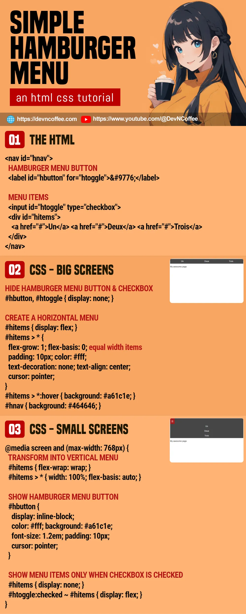
<nav id="hnav">
<!-- (PART A) HAMBURGER MENU BUTTON -->
<label id="hbutton" for="htoggle">☰</label>
<!-- (PART B) MENU ITEMS -->
<input id="htoggle" type="checkbox">
<div id="hitems">
<a href="#">Un</a> <a href="#">Deux</a> <a href="#">Trois</a>
</div>
</nav><div id="hitems">The “regular menu items”.<label id="hbutton" for="htoggle">This is the “hamburger menu button”. Will be hidden on big screens, only show on small screens.<input type="checkbox">Take note of this funky checkbox. There is a reason why we place it before the menu items – Will go through that later.<nav id="hnav">Lastly, wrap everything in a container.
PART 2) HORIZONTAL MENU ON BIG SCREENS
/* (PART A) ON THE BIG SCREENS */
/* (A1) HIDE HAMBURGER MENU BUTTON & CHECKBOX */
#hbutton, #htoggle { display: none; }

/* (A2) CREATE A HORIZONTAL MENU */
#hitems { display: flex; }
#hitems > * {
  flex-grow: 1; flex-basis: 0; /* equal width items */
  padding: 10px; color: #fff;
  text-decoration: none; text-align: center;
  cursor: pointer;
}
#hitems > *:hover { background: #a61c1e; }
#hnav { background: #464646; }- (A1) Hide the hambuger menu button and checkbox. Ignore these for the big screen, they are only useful on small screens.
- (A2) To create a horizontal menu.
- Set the menu to
display: flex. - Space the menu items out equally with
flex-grow: 1; flex-basis: 0; - The rest are just cosmetics.
- Set the menu to
PART 3) VERTICAL MENU ON SMALL SCREENS
/* (PART B) ON THE SMALL SCREENS */
@media screen and (max-width: 768px) {
  /* (B1) TRANSFORM INTO VERTICAL MENU */
  #hitems { flex-wrap: wrap; }
  #hitems > * { width: 100%; flex-basis: auto; }

  /* (B2) SHOW HAMBURGER MENU BUTTON */
  #hbutton {
    display: inline-block;
    color: #fff; background: #a61c1e;
    font-size: 1.2em; padding: 10px;
    cursor: pointer;
  }

  /* (B3) SHOW MENU ITEMS ONLY WHEN CHECKBOX IS CHECKED */
  #hitems { display: none; }
  #hnav input:checked ~ #hitems { display: flex; }
}- (B1) To turn the menu into vertical layout, we simply allow the menu items to wrap into a new row.
- (B2) Show the hamburger menu button.
- (B3) Remember the hidden checkbox? Hide the menu items on small screens by default, show them only when the checkbox is checked.
PART 4) OPTIONAL – DROPDOWN MENU ITEMS
4A) DROPDOWN MENU ITEM HTML
<nav id="hnav">
<!-- (PART A) HAMBURGER MENU BUTTON -->
<label id="hbutton" for="htoggle">☰</label>
<!-- (PART B) MENU ITEMS -->
<input id="htoggle" type="checkbox">
<div id="hitems">
<a href="#">Un</a> <a href="#">Deux</a> <a href="#">Trois</a>
<div class="dgroup">
Dropdown Group
<div class="ditems">
<a href="#">One</a> <a href="#">Two</a> <a href="#">Three</a>
</div>
</div>
</div>
</nav>If you need to create a “dropdown menu item”:
<div class="dgroup">Add a dropdown group to the menu.<div class="ditems">Add the sub-menu items into the group.
4B) DROPDOWN MENU ITEM CSS
/* (PART A) ON THE BIG SCREENS */
/* (A1) PLACE DROPDOWN BELOW MENU ITEM */
.dgroup { position: relative; }
.ditems {
  position: absolute; top: 100%; left: 0; z-index: 9;
  width: 100%; background: #3a3a3a;
}

/* (A2) COSMETICS FOR DROPDOWN MENU ITEMS */
.ditems > * {
  display: block; width: 100%; padding: 10px;
  color: #fff; text-decoration: none; text-align: center;
}
.ditems > *:hover { background: #8b1416; }

/* (A3) ONLY SHOW DROPDOWN ON MOUSE HOVER */
.ditems { display : none; }
.dgroup:hover .ditems { display : block; }

/* (PART B) ON THE SMALL SCREENS */
@media screen and (max-width: 768px) {
  .ditems { position: static; margin-top: 10px; }
}
Some extra CSS for the dropdown menu items, the important mechanics are:
- (A1) Place the sub-menu items below. Set the group to
position: relativeand items toposition: absolute. - (A3) Hide the sub-menu items by default, show it only on mouse hover.
- (B) Resposition the sub-menu items on small screens; Stop “float below group” and restore to “flow as default”.
That’s all. The rest are pretty much just cosmetics.
CHEAT SHEET