Once upon a time, a student created a parallax scrolling wizard thing on his website. It works well in the landscape orientation of big screens but is destroyed on portrait mobile… He then wanted to lock the screen orientation, only to find out there were no straightforward ways to do so.
Yes, Master Coffee is disgusted too. This is another one of those common features that are somehow not properly implemented in web apps (at the time of writing). But it is still possible, with some roundabout methods – Let us walk through some of them.
CODE DOWNLOAD
I have released this under the MIT license, feel free to use it in your own project – Personal or commercial. Some form of credits will be nice though. 🙂
VIDEO TUTORIAL
METHOD 1) SCREEN ORIENTATION LOCK API
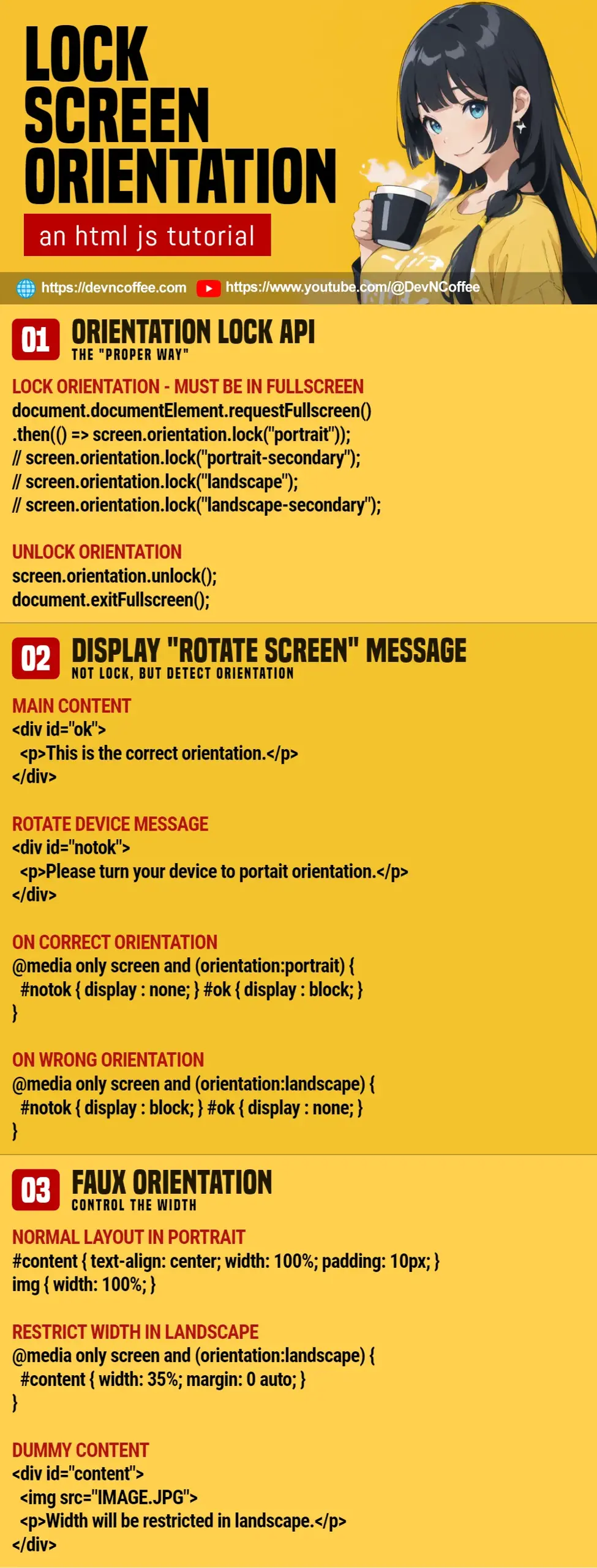
1A) ORIENTATION LOCK & UNLOCK
<script>
// (PART A) LOCK SCREEN ORIENTATION
function lockA () {
  document.documentElement.requestFullscreen()
  .then(() => screen.orientation.lock("portrait"));
  // screen.orientation.lock("portrait-secondary");
  // screen.orientation.lock("landscape");
  // screen.orientation.lock("landscape-secondary");
}

// (PART B) UNLOCK SCREEN ORIENTATION
function unlockA () {
  screen.orientation.unlock();
  document.exitFullscreen();
}
</script>

<!-- (PART C) TEST BUTTONS -->
<input type="button" value="Lock Orientation" onclick="lockA()">
<input type="button" value="Unlock Orientation" onclick="unlockA()">
This is the so-called “proper way” to lock the screen orientation in Javascript.
- Call
screen.orientation.lock(ORIENTATION)to lock the orientation.portraitUpright portrait.portrait-secondary180-degree “upside down” portrait… This one does not seem to work on certain mobile devices.landscapeUpright landscape.landscape-secondary180-degree “opposite” landscape.
- But there’s a caveat to using
screen.orientation.lock()– It must be engaged in fullscreen mode first (usingrequestFullscreen). - Simply do the opposite to unlock – Unlock the orientation, then exit fullscreen… Actually, exiting fullscreen mode will also unlock the orientation automatically.
P.S. Take note that screen.orientation.lock() is only available in certain browsers. You can check the browser compatibility on CanIUse.
1B) LOCK ORIENTATION ON SPECIFIC ELEMENT ONLY
<script>
// (PART A) TOGGLE LOCK/UNLOCK ORIENTATION
function toggleB () {
  // (A1) UNLOCK ORIENTATION
  if (document.fullscreenElement) {
    document.exitFullscreen();
    screen.orientation.unlock();
  }
}

// (A2) UNLOCK ORIENTATION
else {
  document.getElementById("demoB")
  .requestFullscreen()
  .then(() => screen.orientation.lock("portrait"));
}

<!-- (PART B) TEST IMAGE -->
<img id="demoB" src="HTML-ORIENTATION.webp" onclick="toggleB()">
<p>Click on the image to lock/unlock orientation.</p>
A quick note, we can specify which element to “focus on” –
document.documentElement.requestFullscreen()Will engage fullscreen mode on the entire page.ELEMENT.requestFullscreen()Will engage fullscreen mode on the specified element only. Very useful for a fullscreen slideshow or video.
METHOD 2) SHOW MESSAGE ON THE WRONG ORIENTATION
2A) CSS DETECT ORIENTATION
<style>
/* (PART A) DETECT ORIENTATION */
/* (A1) WRONG ORIENTATION */
@media only screen and (orientation:landscape) {
  #notok { display : block; }
  #ok { display : none; }
}

/* (A2) CORRECT ORIENTATION */
@media only screen and (orientation:portrait) {
  #notok { display : none; }
  #ok { display : block; }
}
</style>

<!-- (PART B) MAIN CONTENT -->
<div id="ok">
  <p>This is the correct orientation.</p>
</div>

<!-- (PART C) PLEASE ROTATE DEVICE -->
<div id="notok">
  <p>Please turn your device to portait orientation.</p>
</div>
This is not lock orientation, but an alternative solution using orientation detection.
- Create 2 sections on your page.
<div id="ok">Your “main content”.<div id="notok">Prompt the user to rotate the screen in the wrong orientation.
- This example assumes that portrait is the “correct orientation”.
- In landscape – We hide
okand shownotok. - In portrait – We hide
notokand showok.
- In landscape – We hide
Since the CSS orientation media feature is better supported on most modern browsers, you can say that it is a more “reliable solution”.
2B) JAVASCRIPT DETECT ORIENTATION
<!-- (PART A) MAIN CONTENT -->
<div id="ok" style="display: none;">
  <p>This is the correct orientation.</p>
</div>

<!-- (PART B) PLEASE ROTATE DEVICE -->
<div id="notok" style="display: none;">
  <p>Please turn your device to portait orientation.</p>
</div>

<script>
// (PART C) DETECT ORIENTATION
function toggle () {
  // (C1) CORRECT ORIENTATION
  if (window.orientation == 0) {
    document.getElementById("notok").style.display = "none";
    document.getElementById("ok").style.display = "block";
  }

  // (C2) WRONG ORIENTATION
  else {
    document.getElementById("ok").style.display = "none";
    document.getElementById("notok").style.display = "block";
  }
}
toggle();
window.addEventListener("orientationchange", toggle);
</script>
If you prefer to do orientation detection in Javascript, listen to orientationchange and get the current orientation with window.orientation.
METHOD 3) FAUX SCREEN ORIENTATION
<style>
/* (PART A) NORMAL LAYOUT IN PORTRAIT */
#content {
  text-align: center;
  width: 100%; padding: 10px;
  background: #ebece5;
}
img { width: 100%; }

/* (PART B) RESTRICT WIDTH IN LANDSCAPE */
@media only screen and (orientation:landscape) {
  #content { width: 35%; margin: 0 auto; }
}
</style>

<!-- (PART C) DUMMY CONTENT -->
<div id="content">
  <img src="HTML-ORIENTATION.webp">
  <p>Width will be restricted in landscape.</p>
</div>
Lastly, this is something like “responsive design”.
- In portrait orientation, the layout will be “normal”.
- But in landscape orientation, we restrict the width to look like “portrait orientation”.
P.S. You can try width: 200% to create a “faux landscape”… Although that will also introduce an ugly horizontal scrollbar.
THE END – ADOPT RESPONSIVE DESIGN INSTEAD
That’s all for this short tutorial, and I hope it has helped you. Although Master Coffee is disgusted with not being able to do orientation lock properly, I can also see why – The developers probably want to force people to adopt responsive design.
Unless you have a good reason to implement an orientation lock, the priority should be making your website responsive. It should fit on “any screen size” and “any orientation”… Not “limited to this orientation only”.
CHEAT SHEET