Once upon a time, a student did all kinds of “layering” and “funky CSS hacks” to create a responsive background image. Master Coffee couldn’t help but shake his head. It’s not the Stone Age of the Internet anymore, responsive background images are actually very easy. Let Master Coffee show you how, let’s go.
CODE DOWNLOAD
I have released this under the MIT license, feel free to use it in your own project – Personal or commercial. Some form of credits will be nice though. 🙂
VIDEO TUTORIAL
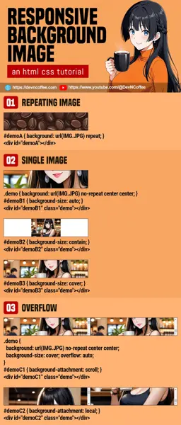
1) REPEATING BACKGROUND IMAGE
<!-- (PART A) REPEATING PATTERN -->
<div id="demoA" class="demo"></div>/* (PART A) REPEATING PATTERN */
#demoA {
background: url(HTML-BG-IMG-1.webp) repeat;
}As easy as it gets – Set the image as a repeating background. Just do a “free seamless background” search on the Internet, and there should be plenty… If you are not allergic to “AI”, you can also try generating your own patterns.
2) SINGLE BACKGROUND IMAGE
<!-- (PART B1) CENTERED AUTO -->
<div id="demoB1" class="demo"></div>

<!-- (PART B2) CENTERED CONTAIN -->
<div id="demoB2" class="demo"></div>

<!-- (PART B3) CENTERED COVER -->
<div id="demoB3" class="demo"></div>/* (PART B) SINGLE IMAGE */
#demoB1, #demoB2, #demoB3 {
background: url(HTML-BG-IMG-2.webp) no-repeat center center;
}
#demoB1 { background-size: auto; }
#demoB2 { background-size: contain; }
#demoB3 { background-size: cover; }background: url(HTML-BG-IMG-2.webp) no-repeat center centerSet the background image, centered and don’t repeat.background-sizeYep, the key to creating a “responsive background image” is probably this one.autoThe default, let the browser decide how to fit the image.containScale the image to fit into the container. As above, this one may not be a good choice as it may leave empty spaces.coverStretch the image to fill up the entire container.- Of course, you can also set it to exact pixels and percentage. For example,
100%will fit the container exactly, and200%will stretch the image twice.
3) OVERFLOW ATTACHMENT
<!-- (PART C1) SCROLL BACKGROUND -->
<div id="demoC1" class="demo">
  <div class="dummy"></div>
</div>

<!-- (PART C2) LOCAL BACKGROUND -->
<div id="demoC2" class="demo">
  <div class="dummy"></div>
</div>#demoC1, #demoC2 {
height: 200px; overflow: auto;
background: url(HTML-BG-IMG-2.webp) no-repeat center;
background-size: cover;
}
#demoC1 { background-attachment: scroll; }
#demoC2 { background-attachment: local; }Lastly, where do you want the background image to be “anchored” to?
background-attachment: scrollWill take the container as the reference. The background image will not shift when scrolling.background-attachment: localWill take the contents as the reference. The background image will scroll along.background-attachment: fixedNot in the example above, but takes the page as reference. Background image will scroll only with the entire page.
THE END – A QUICK SUMMARY
That’s all for this super short and simple tutorial. For the beginners who are still lost, don’t fret. There are only 5 “CSS background stuff” you need to set:
background-imageThe image to use as background.background-repeatRepeat the background as a pattern or not?background-positionThe lazy way is to set this tocenter. But if you want to “tweak” where the background image goes, feel free to give this an exact pixel or percentage.background-sizeAs above,auto contain cover.background-attachmentAs above,scroll local fixed.
That’s all. Master these 5 and background images will no longer be a headache.
CHEAT SHEET

