Once upon a time in the Dark Ages of the Internet, creating a square grid involves all kinds of crazy CSS hacks… It even needs Javascript to manually “readjust” the items when the window is being resized. But now, things are easy with modern CSS. Let’s Master Coffee walk you through a simple example, let’s go!
CODE DOWNLOAD
I have released this under the MIT license, feel free to use it in your own project – Personal or commercial. Some form of credits will be nice though. 🙂
VIDEO TUTORIAL
RESPONSIVE SQUARE GRID DEMO
Go ahead – Resize the window and this will remain in a 2X2 squares grid.
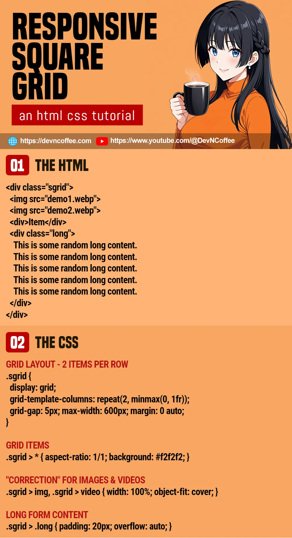
PART 1) THE HTML
<div class="sgrid">
  <img src="demo1.webp">
  <img src="demo2.webp">
  <div>Item</div>
  <div class="long">
    This is some random long content.
    This is some random long content.
    This is some random long content.
    This is some random long content.
    This is some random long content.
    This is some random long content.
    This is some random long content.
    This is some random long content.
    This is some random long content.
    This is some random long content.
  </div>
</div>
For this example, we will go with a simple grid with only 4 items.
<div class="sgrid">This is the grid container.<img>Within are 2 images – One is square, and the other rectangle.<div>Item</div>A “simple grid item”.<div class="long">A grid item with a lot of content. We will need to deal with these in one way or another.
PART 2) THE CSS – CREATING THE GRID
/* (PART A) GRID LAYOUT */
.sgrid {
  /* (A1) 2 ITEMS PER ROW */
  display: grid;
  grid-template-columns: repeat(2, minmax(0, 1fr));

  /* (A2) OPTIONAL */
  grid-gap: 5px;
  max-width: 600px;
  margin: 0 auto;
}

/* (PART B) GRID ITEMS */
.sgrid > * {
  aspect-ratio: 1/1;
  background: #f2f2f2;
}- To create a grid layout, simply set
display: grid. - For this example, we go with 2 items per row –
grid-template-columns: repeat(2, minmax(0, 1fr)). Theminmaxhere is to make sure that the items are of equal width. - Lastly, create the squares.
- For the beginners,
.sgrid > *will select the direct children of<div class="sgrid">. - Setting an aspect ratio of 1:1 will technically do the trick –
aspect-ratio: 1/1. - Yes, technically. Even though 1:1 aspect ratio will create a square, the square can stretch itself to fit images and content as required.
- For the beginners,
PART 3) THE CSS – DEALING WITH GRID ITEMS
/* (PART C) "CORRECTION" FOR IMAGES & VIDEOS */
.sgrid > img, .sgrid > video {
  width: 100%;
  object-fit: cover;
}

/* (PART D) LONG FORM CONTENT */
.sgrid > .long {
  padding: 20px;
  overflow: auto;
}
Lastly, we need some “extras” to make sure the grid items “remain square”.
- For images and videos, setting
width: 100%andobject-fit: coverwill automatically resize them to fit into the square. - As for items with “long and naggy text”, one way is to add a scrollbar with
overflow: auto. It’s ugly, but it works.
THE END – REARRANGE ITEMS PER ROW
That’s all for this short tutorial and sharing, just one last “small addon” before we end – We can also change the layout depending on the screen size, this is called “media query”:
@media screen and (max-width: 640px) {
  .sgrid { grid-template-columns: auto; }
}
Yep, this will collapse into a single column on small screens. Feel free to customize the grid however you wish, and good luck with your project!
CHEAT SHEET