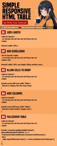
Once upon a time, a student went into a deep trance because he couldn’t fit a table into a small mobile screen. Well, it’s not the student’s fault. It’s more of a design issue than a technical one. So let Master Coffee walk you through some “possible solutions”, let’s go!
CODE DOWNLOAD
I have released this under the MIT license, feel free to use it in your own project – Personal or commercial. Some form of credits will be nice though. 🙂
VIDEO TUTORIAL
1) SET 100% WIDTH
<table id="demoA">
  <tr><td>One</td><td>Two</td><td>Three</td></tr>
  <tr><td>One</td><td>Two</td><td>Three</td></tr>
  <tr><td>One</td><td>Two</td><td>Three</td></tr>
</table>

<style>
/* (PART B) 100% WIDTH */
#demoA { width: 100%; }
</style>| One | Two | Three |
| One | Two | Three |
| One | Two | Three |
The easiest solution of them all. Just set width: 100% on the table, and it will scale itself to fit. But take note, this will only work if your table is still somewhat manageable and can squeeze into a small screen.
2) ADD SCROLLBARS
<!-- (PART A) DUMMY TABLE -->
<div id="demoB"><table>
  <tr><td>One</td><td>Two</td><td>Three</td></tr>
  <tr><td>One</td><td>Two</td><td>Three</td></tr>
  <tr><td>One</td><td>Two</td><td>Three</td></tr>
</table></div>

<style>
/* (PART B) RESTRICT 100% WIDTH & SET OVERFLOW */
#demoB {
  width: 100%;
  max-height: 200px; /* optional */
  overflow: auto;
}

/* (PART X) NOT IMPORTANT - DEMO */
#demoB table { width: 200%; }
#demoB tr { height: 100px; }
</style>| One | Two | Three |
| One | Two | Three |
| One | Two | Three |
The next easy solution:
- Wrap the table in a
<div>. - Set it to
width: 100%andoverflow: auto.
That’s all. The table will retain its dimensions, although there will be “ugly scrollbars” around it.
3) ALLOW CELLS TO WRAP INTO NEW ROWS
<!-- (PART A) DUMMY TABLE -->
<table id="demoC">
  <tr><td>One</td><td>Two</td><td>Three</td></tr>
  <tr><td>One</td><td>Two</td><td>Three</td></tr>
  <tr><td>One</td><td>Two</td><td>Three</td></tr>
</table>

<style>
/* (PART B) 100% WIDTH */
#demoC { width: 100%; }

/* (PART C) SMALL SCREEN ONLY */
@media screen AND (max-width: 768px) {
  /* (C1) ALLOW CELLS TO WRAP INTO NEW ROW */
  #demoC tr { display: flex; flex-wrap: wrap; }

  /* (C2) NOT IMPORTANT - DEMO */
  #demoC td { width: 50%; }
}
</style>| One | Two | Three |
| One | Two | Three |
| One | Two | Three |
This is a rather unconventional solution.
- (A & B) On big screens, this is a regular table with 100% width.
- (C) But on small screens – We turn the rows into
display: flex, and allow the cells to wrap in new rows withflex-wrap: wrap.
4) HIDE CERTAIN COLUMNS
<!-- (PART A) DUMMY TABLE -->
<table id="demoD">
  <tr><td>One</td><td>Two</td><td>Three</td></tr>
  <tr><td>One</td><td>Two</td><td>Three</td></tr>
  <tr><td>One</td><td>Two</td><td>Three</td></tr>
</table>

<style>
/* (PART B) 100% WIDTH */
#demoD { width: 100%; }

/* (PART C) SMALL SCREEN ONLY - HIDE SECOND COLUMN */
@media screen AND (max-width: 768px) {
  #demoD tr td:nth-child(2) { display: none; }
}
</style>| One | Two | Three |
| One | Two | Three |
| One | Two | Three |
If there are some not-so-important columns, you can hide them using td:nth-child(N) { display: none; } to “save some space”.
P.S. To hide multiple columns, you will have to define that multiple times – td:nth-child(N), td:nth-child(M), td:nth-child(O) { display: none; }
5) FULLSCREEN TABLE
<!-- (PART A) DUMMY TABLE -->
<table id="demoE">
  <tr><td>One</td><td>Two</td><td>Three</td></tr>
  <tr><td>One</td><td>Two</td><td>Three</td></tr>
  <tr><td>One</td><td>Two</td><td>Three</td></tr>
</table>

<style>
/* (PART B) 100% WIDTH */
#demoE { width: 100%; }
#demoE:fullscreen { background: #fff; }
</style>

 <script>
/* (PART C) ON WINDOW LOAD */
window.addEventListener("load", () => {
  // (C1) GET TABLE
  let table = document.getElementById("demoE");

  // (C2) DOUBLE CLICK TO TOGGLE FULLSCREEN
  table.addEventListener("dblclick", () => {
    if (document.fullscreenElement) {
      document.exitFullscreen();
    } else {
      table.requestFullscreen()
      .then(() => screen.orientation.lock("landscape"));
    }
  });
});
</script>| One | Two | Three |
| One | Two | Three |
| One | Two | Three |
Lastly, this is not quite “responsive design”, but a possible solution nonetheless. TLDR – Double-click to show the table in fullscreen mode, landscape orientation. But try to reserve this for “important tables only”. It will be super weird if every table, list, image, and video on your page can be toggled into fullscreen mode.
THE END – LET THE POWERS COMBINE
That’s all for this short tutorial, one small bit before we end – Don’t restrict yourself to one solution, mix and match the above mechanics to find whichever works best for you. For example:
- Hide some columns on small screens, but show them when fullscreen mode is engaged.
- Double-click to show the overflow
<div><table>container in fullscreen mode. - For a massive table – Hide some columns, and allow the cells to wrap.
CHEAT SHEET

