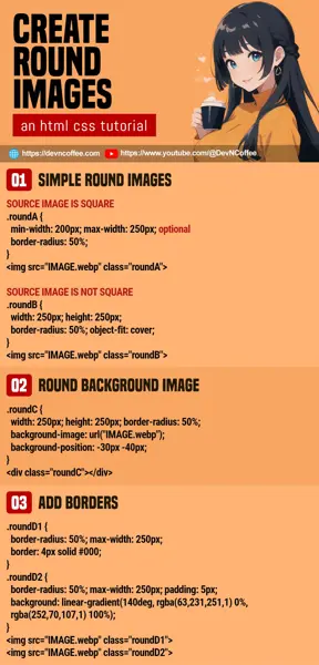
Once upon a time, a student manually edited a dozen images to “make them round”. Master Coffee love hardworking students, but there are easier ways to create round images in HTML CSS – Let’s go through a few simple examples.
CODE DOWNLOAD
I have released this under the MIT license, feel free to use it in your own project – Personal or commercial. Some form of credits will be nice though. 🙂
VIDEO TUTORIAL
ORIGINAL IMAGES


Here are 2 demo images that we will work with in this example – One is “nicely cut” into a square, and another in portrait orientation.
1) FOR SQUARE IMAGES
rounded.html
<!-- (PART A) SQUARE IMAGE -->
<style>
.roundA {
  border-radius: 50%;
  /* optional */
  min-width: 200px; max-width: 250px;
}
</style>
<img src="ROUND-A.webp" class="roundA">
- To create a rounded image, it is as simple as adding
border-radius:50%to it. - If you want “responsive support”, just limit the dimensions with
min-widthand/ormax-width.
2) FOR “NOT SQUARE” IMAGES
rounded.html
<!-- (PART B) NOT SQUARE -->
<style>
.roundB {
  width: 250px; height: 250px;
  border-radius: 50%;
  object-fit: cover;
}
</style>
<img src="ROUND-B.webp" class="roundB">
- If we add
border-radius:50%to an image that is not square, it will turn into an oval. - How we “fix” it is simple – Manually define an equal
widthandheight. - Lastly, use
object-fitto control how the image is resized. Possible values arefill, contain, cover, none, scale-down.
3) ROUNDED BACKGROUND IMAGE
rounded.html
<!-- (PART C) BACKGROUND IMAGE -->
<style>
.roundC {
  width: 250px; height: 250px;
  border-radius: 50%;
  background-image: url("ROUND-B.webp");
  background-position: -30px -40px;
}
</style>
<div class="roundC"></div>- It is also possible to create rounded background images. Start with a square container with equal
widthandheight. - Set the
background-imageand the usualborder-radius: 50%. - Lastly, you can shift the image around with
background-position.
EXTRA) ADDING BORDERS
rounded.html
<!-- (PART D) BORDERS -->
<style>
.roundD1 {
  border-radius: 50%; max-width: 250px;
  border: 4px solid #000;
}
.roundD2 {
  border-radius: 50%; max-width: 250px;
  border: 4px dashed rgb(255, 94, 94);
}
.roundD3 {
  border-radius: 50%; max-width: 250px;
  padding: 5px;
  background: linear-gradient(140deg, rgba(63,231,251,1) 0%, rgba(252,70,107,1) 100%);
}
</style>
<img src="ROUND-A.webp" class="roundD1">
<img src="ROUND-A.webp" class="roundD2">
<img src="ROUND-A.webp" class="roundD3">


- For those who wants to “add a frame”, we can use the usual
borderto build one. - We can also apply a gradient border, although it’s kind of roundabout.
- A gradient border can be created using
border-image: linear-gradient(...), but that will not work withborder-radius. - So as an “alternative”, we set
background: linear-gradient(...)and add the “border” usingpadding.
- A gradient border can be created using
THE END – RESIZE YOUR IMAGES
That’s all for this short tutorial and sharing. Even though Master Coffee said it is easier using CSS, don’t be lazy with resizing the source images.
- It’s a really bad idea to load a 9999 megapixels source image and only use 300 pixels of it for a “small round image”.
- For those who are lost – CSS does not reduce the source image size. The brower still loads a 9999 megapixels image before applying CSS resize on it.
- For those who are very lost – This is extremely bad for the performance and loading speed.
- So either “batch auto resize” the images manually, or install something “smart” on your web server that will do this for you automatically.
CHEAT SHEET

