Once upon a time, a student is tasked to create an admin panel. He then turned to various frameworks, spending days and sleepless nights trying to create one… Well, that does not have to be the case. Let Master Coffee walk you through a simple admin panel design, no third-party frameworks used. Let’s go.
CODE DOWNLOAD
I have released this under the MIT license, feel free to use it in your own project – Personal or commercial. Some form of credits will be nice though. 🙂
VIDEO TUTORIAL
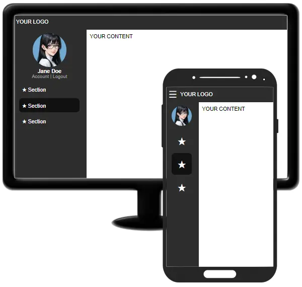
SCREENSHOT
PART 1) HTML HEADER META
<meta charset="utf-8">
<meta name="viewport" content="width=device-width, initial-scale=1.0, maximum-scale=1.0, user-scalable=no">
<meta name="robots" content="noindex">
<meta charset="utf-8">Self-explanatory. This page uses the UTF-8 character set.<meta name="viewport">This will disable the pinch-zoom on mobile devices.<meta name="robot">Don’t allow robots to index the admin panel.
PART 2) HTML LAYOUT
<!-- (PART A) TOP NAV BAR -->
<nav id="top">
<!-- (PART A1) SIDEBAR TOGGLE -->
<div id="stog" onclick="document.getElementById('side').classList.toggle('mini')">
☰
</div>
<!-- (PART A2) LOGO & WHATEVER ELSE -->
YOUR LOGO
</nav>
<!-- (PART B) BOTTOM CONTENT -->
<div id="bottom">
<!-- (PART B1) SIDEBAR -->
<nav id="side" class="mini">
<!-- (PART B1-1) CURRENT USER -->
<div id="suser">
<img id="upic" src="admin.webp">
<div id="uname">Jane Doe</div>
<div id="uacct"> Account | Logout</div>
</div>
<!-- (PART B1-2) LINKS -->
<div id="slinks">
<a href="#">
<i>★</i> <span>Section</span>
</a>
<a href="#" class="now">
<i>★</i> <span>Section</span>
</a>
<a href="#">
<i>★</i> <span>Section</span>
</a>
</div>
</nav>
<!-- (PART B2) MAIN CONTENT -->
<main id="main">YOUR CONTENT</main>
</div>Before you start to think “very difficult”, keep calm and study closely:
- (A & B) The page is split into the top navigation bar
<nav id="top">and bottom content<div id="bottom">. - (B1 & B2) The bottom content is further split into the sidebar
<nav id="side">and main content area<main id="main">. - That’s about it. A few other “small details”:
- (A1) The sidebar will shrink on small screens.
<div id="stog">is the menu button to toggle the sidebar. - (A2) Insert your logo, search bar, notifications, whatever else here.
- (B1) The sidebar has 2 “main components” – Current user
<div id="suser">and links<div id="slinks">. - (B1-2) Each link has an icon
<i>and text<span>. Feel free to use a library of your choice for the icon, or stick with HTML symbols for simplicity. - (B2) Insert your content here.
- (A1) The sidebar will shrink on small screens.
PART 3) THE CSS
3A) TOP NAV BAR & BOTTOM CONTENT
/* (PART A) SHARED */
/* (PART A1) STANDARD FONT & BOX SIZING */
* {
  font-family: Arial, Helvetica, sans-serif;
  box-sizing: border-box;
}

/* (PART A2) COLOR & PADDING */
#top, #side { color: #fff; background: #2d2d2d; }
#top, #side, #main, #slinks { padding: 10px; }

/* (PART A3) FLEX LAYOUT */
html, body, #top, #bottom { display: flex; }
#bottom, #main { flex-grow: 1; }

/* (PART B) BODY - SPLIT TOP-BOTTOM */
html, body {
  padding: 0; margin: 0; min-height: 100vh;
  flex-direction: column;
}

/* (PART C) TOP NAV BAR */
#top {
  position: sticky; height: 50px;
  align-items: center;
}
This can be a little confusing for beginners, but let’s start by splitting the page into top and bottom sections:
- (A3) Set the page, top, and bottom sections to flex layout –
html, body, #top, #bottom { display: flex; } - (B) Remove the default page spacing –
html, body { padding: 0; margin: 0 } - (B) Split the page into “top nav bar” and “bottom contents” –
html, body { flex-direction: column; } - (B & A3) Make sure the page fills up the window –
html, body { min-height: 100vh; }and#bottom { flex-grow: 1; }
3B) SIDEBAR
/* (PART D1) SIDEBAR */
#side { width: 220px; transition: all 0.2s; }

/* (PART D2) SIDEBAR USER */
#suser { text-align: center; }
#upic {
  width: 100px; height: 100px;
  border-radius: 50%;
}
#uname { font-weight: 700; }
#uacct { font-size: 14px; color: #a5a5a5; }

/* (PART D3) SIDEBAR LINKS */
#slinks a {
  display: block;
  padding: 10px 8px; margin-bottom: 5px;
  color: #fff; text-decoration: none;
}
#slinks a:hover, #slinks a.now {
  background: #111; border-radius: 10px;
}
#slinks i { font-style: normal; }
Next, we deal with the sidebar.
- (D1 & A3) Set the width of the sidebar
#side { width: 220px; }, let the main area fill up the rest#main { flex-grow: 1; }. - (D2 & D3) Pretty much just cosmetics for the user and links.
3D) RESPONSIVE “ADD ON”
/* (PART E) RESPONSIVE */
/* (PART E1) SIDEBAR TOGGLE BUTTON */
#stog {
  display: none; cursor: pointer;
  font-size: 28px; margin-right: 10px;
}

/* (PART E2) ON SMALL SCREENS */
@media screen and (max-width: 600px) {
  /* (PART E2-1) SHOW TOGGLE BUTTON */
  #stog { display: block; }

  /* (PART E2-2) SHRINK SIDEBAR */
  #side.mini { width: 100px; }
  #side.mini #upic { width: 60px; height: 60px; }
  #side.mini #uname, #side.mini #uacct, #side.mini #slinks span { display: none; }
  #side.mini #slinks a { text-align: center; }
  #side.mini #slinks i { font-size: 32px; }
}
Some changes to cater for small screens:
- (E1) Cosmetics for the
<div id="stog">menu toggle button, hide on big screens. - (E2) On small screens, show the menu toggle button and shrink the sidebar.
- (E2) Take note of the attached
.miniCSS class. When the user clicks on the toggle button, this CSS class will be removed and revert to “normal size”.
THE END – FREE ICON SETS
That’s all for this quick tutorial and sharing. All that’s left for you to do is to turn this into a template, in whichever programming language and template system you are using. If you are looking for good icon sets, here are a few that Master Coffee commonly use: