Once upon a time, a student had to create an image gallery. She turned to the Internet, found a whole bunch of “professional gallery”, and complained about “they are very difficult to implement”. So here it is, let Master Coffee walk you through how to create a very simple image gallery – Let’s go.
CODE DOWNLOAD
I have released this under the MIT license, feel free to use it in your own project – Personal or commercial. Some form of credits will be nice though. 🙂
VIDEO TUTORIAL
RESPONSIVE IMAGE GALLERY DEMO


Go ahead – Resize the window and see how the gallery rearrange itself.
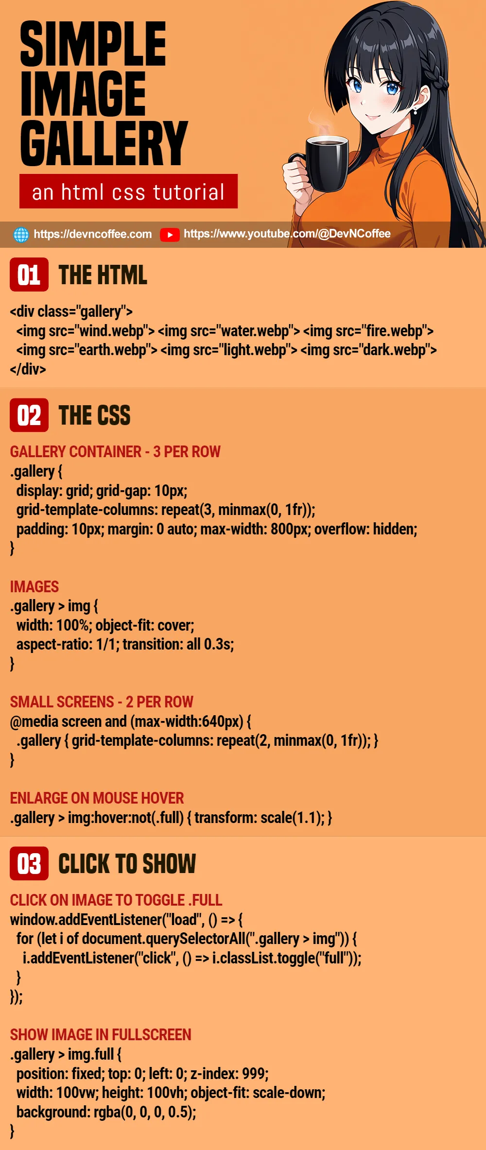
PART 1) THE HTML
<!-- (PART A) IMAGE GALLERY -->
<div class="gallery">
  <img src="wind.webp">
  <img src="water.webp">
  <img src="fire.webp">
  <img src="earth.webp">
  <img src="light.webp">
  <img src="dark.webp">
</div>
This is as simple as it gets. Just put all your images into a <div> container.
P.S. You may want to add decode="async" to all the images, so they load asynchronously.
PART 2) THE CSS – GRID GALLERY
/* (PART A) GALLERY CONTAINER */
.gallery {
  /* (A1) GRID LAYOUT - 3 PER ROW */
  display: grid;
  grid-template-columns: repeat(3, minmax(0, 1fr));

  /* (A2) OPTIONAL */
  grid-gap: 10px;
  max-width: 800px;
  padding: 10px; margin: 0 auto;
  overflow: hidden;
}

/* (PART B) IMAGES */
.gallery > img {
  width: 100%; object-fit: cover;
  aspect-ratio: 1/1;
  transition: all 0.3s;
}

/* (PART C) SMALL SCREENS - 2 PER ROW */
@media screen and (max-width:640px) {
  .gallery {
    grid-template-columns: repeat(2, minmax(0, 1fr));
  }
}

/* (PART D) ENLARGE ON MOUSE HOVER */
.gallery > img:hover:not(.full) {
  transform: scale(1.1);
}- (A) To turn the
<div>container into a gallery, we simply set it togridlayout. By default, this will show 3 items per row on big screens. - (B) Assuming that the images are of different sizes and orientation, this bit will make sure that they are all in “equal squares”. Feel free to change the aspect ratio.
- (C) On small screens, change the layout to 2 items per row.
- (D) This is optional, just some “nice cosmetics” to enlarge the image on mouse hover – A visual cue to the users that they can click to show the image in full size.
PART 3) SHOW IMAGE IN FULL SIZE
<!-- (PART B) TOGGLE FULLSCREEN -->
<script>
window.addEventListener("load", () => {
  for (let i of document.querySelectorAll(".gallery > img")) {
    i.addEventListener("click", () => i.classList.toggle("full"));
  }
});
</script>/* (PART E) SHOW SELECTED IMAGE IN FULLSCREEN */
.gallery > img.full {
position: fixed; top: 0; left: 0; z-index: 999;
width: 100vw; height: 100vh;
object-fit: scale-down;
background: rgba(0, 0, 0, 0.5);
}No need to panic, what this last bit does:
- On window load, we use Javascript to loop through all the gallery images.
- On clicking an image, toggle a
fullCSS class on the selected image. - As you can see, all
.fulldoes is to set the image to “full screen mode”.
THE END – IMAGE CAPTION
That’s all for this short tutorial and sharing. Just one last bit before we end – If you want to display captions, one of the laziest and easiest ways is to add title="CAPTION" on the images. Just mouse hover on the image for a while and it will display.
CHEAT SHEET