Once upon a time, a student wanted to add fancy speech bubbles on her page. She confidently did it with “just use a speech bubble image and position text over it”. Well, that works. But we can do it in modern CSS with some clever mechanics. Let Master Coffee show you how, let’s go.
CODE DOWNLOAD
I have released this under the MIT license, feel free to use it in your own project – Personal or commercial. Some form of credits will be nice though. 🙂
VIDEO TUTORIAL
PART 1) CREATE A “SPEECH BOX”
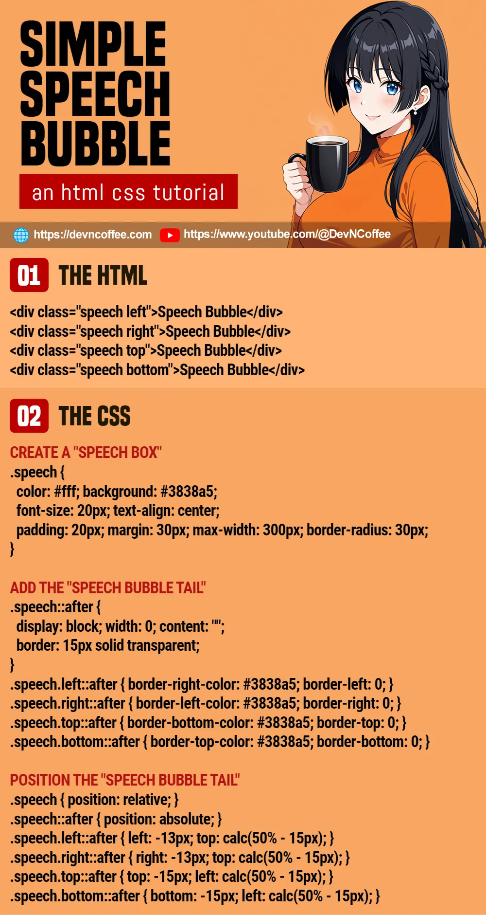
<div class="speech">Speech Bubble</div>/* (PART A) CREATE A "SPEECH BOX" */
.speech {
color: #fff; background: #3838a5;
font-size: 24px; text-align: center;
padding: 20px; margin: 30px; max-width: 400px;
border-radius: 30px;
}This should not be too much trouble, we start with “creating a usual HTML box” – Set the colors, font size, and dimensions.
P.S. If you want a “responsive speech bubble”, just set a percentage width.
PART 2) THE MAGIC CSS TRIANGLE
<style>
.borders {
  width: 0;
  border-top: 20px solid red;
  border-bottom: 20px solid green;
  border-left: 20px solid blue;
  border-right: 20px solid yellow;
}
.triangle {
  border-top-color: transparent;
  border-bottom-color: transparent;
  border-right: 0;
}
</style>

<div class="borders"></div>
<div class="borders triangle"></div>
Before we proceed, here’s a neat CSS trick you need to know – Creating triangles with borders.
- If we set different border colors on all 4 edges, they will cut at 45 degrees.
- To create a “right triangle”:
- We keep the left edge.
- Set the top and bottom to transparent.
- Remove the right edge.
PART 3) ADDING A “SPEECH BUBBLE TAIL”
<div class="speech left">Speech Bubble</div>
<div class="speech right">Speech Bubble</div>
<div class="speech top">Speech Bubble</div>
<div class="speech bottom">Speech Bubble</div>/* (PART B) ADD THE "SPEECH BUBBLE TAIL" */
.speech::after {
display: block; width: 0; content: "";
border: 15px solid transparent;
}
.speech.left::after {
border-right-color: #3838a5;
border-left: 0;
}
.speech.right::after {
border-left-color: #3838a5;
border-right: 0;
}
.speech.top::after {
border-bottom-color: #3838a5;
border-top: 0;
}
.speech.bottom::after {
border-top-color: #3838a5;
border-bottom: 0;
}So far so good? Using the border triangle trick, we can now create the “speech bubble tail”.
- Set “full transparent borders” on the
::afterpseudo-class of the speech bubble –border: 15px solid transparent - Depending on where you want the “tail” to face, set the borders accordingly –
border-left-color border-right-color border-top-color border-bottom-color
PART 4) POSITION THE “SPEECH BUBBLE TAIL”
/* (PART C) POSITION THE "SPEECH BUBBLE TAIL" */
.speech { position: relative; }
.speech::after { position: absolute; }
.speech.left::after { left: -13px; top: calc(50% - 15px); }
.speech.right::after { right: -13px; top: calc(50% - 15px); }
.speech.top::after { top: -15px; left: calc(50% - 15px); }
.speech.bottom::after { bottom: -15px; left: calc(50% - 15px); }Lastly, position the tails at “where they should be”. The end, you have a “fully functioning” speech bubble built using pure HTML CSS only.
THE END – FEEL FREE TO CUSTOMIZE
That’s all for this short tutorial and sharing. Now that you have a grasp of the basics feel free to modify the speech bubble as you see fit. Set the colors, dimensions, set a longer tail, turn it into a “true circle speech bubble” with 50% border radius – It’s all up to you now.
CHEAT SHEET