Once upon a time, a student wanted to create a transparent background and confidently said “just set the opacity”. Within seconds, his dreams are smashed as the opacity applies to the entire container. Just how do we properly create a “transparent background only”? Let Master Coffee show you how – Let’s go.
CODE DOWNLOAD
I have released this under the MIT license, feel free to use it in your own project – Personal or commercial. Some form of credits will be nice though. 🙂
VIDEO TUTORIAL
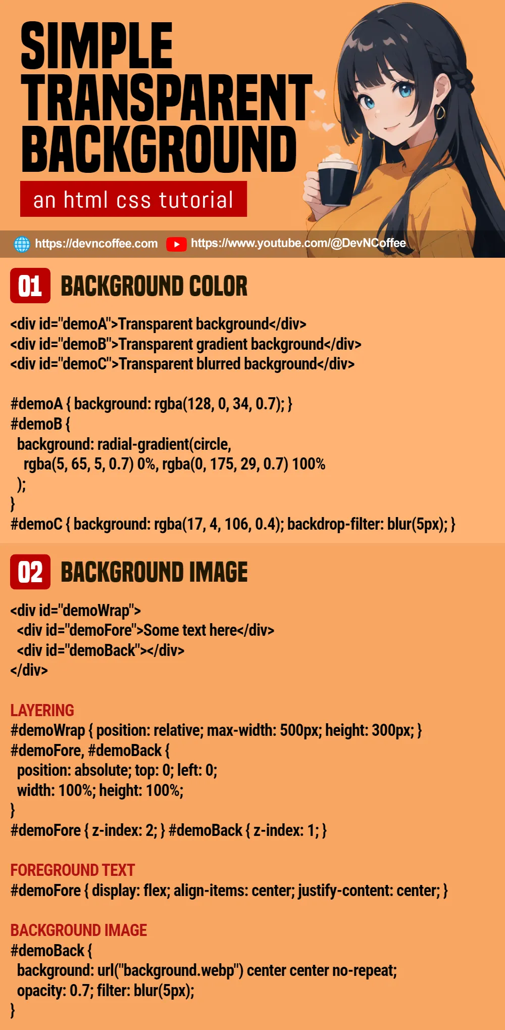
1) TRANSPARENT BACKGROUND COLOR
<div id="demoA">Transparent background</div>
<div id="demoB">Transparent gradient background</div>
<div id="demoC">Transparent blurred background</div>/* (PART A) TRANSPARENT SOLID COLOR */
#demoA {
background: rgba(255, 0, 68, 0.7);
}
/* (PART B) TRANSPARENT GRADIENT COLOR */
#demoB {
background: radial-gradient(circle, rgba(5, 65, 5, 0.7) 0%, rgba(0, 175, 29, 0.7) 100%);
}
/* (PART C) TRANSPARENT COLOR WITH BLUR */
#demoC {
background: rgba(25, 0, 255, 0.4);
backdrop-filter: blur(5px);
}- To define a transparent background color, use
background: rgba(RED, GREEN, BLUE, ALPHA). For those who are new:RED GREEN BLUEis a number from 0-255, defining “how much of each respective color to mix”.ALPHAis a decimal from 0-1. 0 being “invisible” and 1 being “opaque”.
- Yes, we can apply
rgba()in a gradient color background as well. It is easier to use an online “css gradient generator tool” to help you. - Lastly, we can also add
backdrop-filter: blur(N px)to blur the background.
2) TRANSPARENT BACKGROUND IMAGE
2A) THE DEMO
2B) THE HTML
<div id="demoWrap">
  <div id="demoFore">Some text here</div>
  <div id="demoBack"></div>
</div>
<div id="demoWrap">A wrapper for the content and background image.<div id="demoFore">Foreground, for the contents.<div id="demoBack">Background, for the image.
Things are a little different when it comes to a transparent background image… This “layering” is necessary, you will see why in the CSS below.
2C) THE CSS
/* (PART A) LAYERING */
#demoWrap {
  position: relative;
  max-width: 500px; height: 300px;
}
#demoFore, #demoBack {
  position: absolute; top: 0; left: 0;
  width: 100%; height: 100%;
}
#demoFore { z-index: 2; }
#demoBack { z-index: 1; }

/* (PART B) FOREGROUND TEXT */
#demoFore {
  display: flex; align-items: center; justify-content: center;
}

/* (PART C) BACKGROUND IMAGE */
#demoBack {
  background: url("background.png") center center no-repeat;
  opacity: 0.7; filter: blur(5px);
}- First, we stack the foreground on top of the background.
- Set the wrapper to
position: relativeand the foreground/background toposition: absolute. - Set both foreground and background to fill the container with
width: 100%; height: 100%; - Stack the foreground in front with
z-index: 2, and the background behind withz-index: 1.
- Set the wrapper to
- Some cosmetics for the foreground. In this example, we simply center the content.
- Lastly, set the background image, the opacity, and blur it optionally.
To answer why this layering is necessary, there is no such thing as “background image opacity” at the time of writing. If we set both background image and opacity on a container, it will create a fully transparent container – Both the background image and content will be transparent.
THE END – FADE EFFECT
That’s all for this short tutorial and sharing, one more extra before we end. Now that you know how to set the transparency, it is also easy to play with it to create fade effects:
- Set transparent background and CSS transition –
#demo { background: rgba(255, 0, 0, .7); transition: all 1s; } - Change the opacity on mouse hover –
#demo:hover { background: rgba(255, 0, 0, .3); } - Alternatively, use Javascript to toggle it –
document.getElementById("demo").style.background = "rgba(255, 0, 0, 0.3)";
CHEAT SHEET