Once upon a time, a student took a screenshot of his page. Edited the screenshot in an image app, selected some text, and blurred them. Master Coffee is shocked by his level of commitment. But there is a much easier way, we can directly add blur effect in CSS… Let Master Coffee show you how, let’s go.
CODE DOWNLOAD
I have released this under the MIT license, feel free to use it in your own project – Personal or commercial. Some form of credits will be nice though. 🙂
VIDEO TUTORIAL
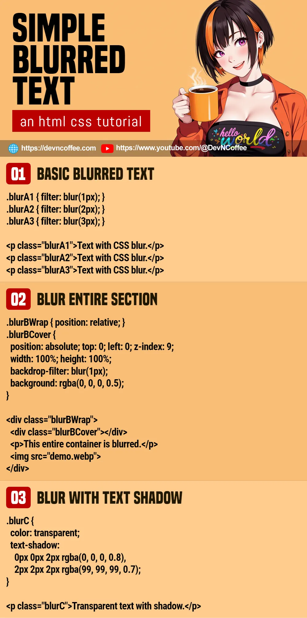
1) CSS BLUR FILTER
<style>
.blurA1 { filter: blur(1px); }
.blurA2 { filter: blur(2px); }
.blurA3 { filter: blur(3px); }
</style>

<p class="blurA1">Text with CSS blur.</p>
<p class="blurA2">Text with CSS blur.</p>
<p class="blurA3">Text with CSS blur.</p>
Text with CSS blur.
Text with CSS blur.
Text with CSS blur.
- Yes, creating a block of blurred text is as simple as applying
filter: blur(N). - Use
Nto adjust the spread and “blur level”. - Yes, the blur effect can also be applied to almost anything. See example below.
2) CSS BLUR “LAYERING”
<style>
.blurBWrap { position: relative; }
.blurBCover {
  position: absolute;
  top: 0; left: 0; z-index: 999;
  width: 100%; height: 100%;
  backdrop-filter: blur(1px);
  background: rgba(0, 0, 0, 0.5);
}
</style>

<div class="blurBWrap">
  <div class="blurBCover"></div>
  <p>This entire container is blurred.</p>
  <img src="demo.webp">
</div>
This entire container is blurred.

The CSS blur effect can also be applied to “things other than text”. But if you want to blur an entire section, the easy way is to place a “blurred layer” over it.
<div class="blurBWrap">Create a wrapper and place the content inside.<div class="blurBCover">Add a “blur cover” inside the wrapper.- Stack the “blur cover” on top.
.blurBWrap { position: relative; }Set the wrapper to relative position..blurBCover { position: absolute; top: 0; left: 0; z-index: 9; }Set the “blur cover” to absolute top left position.width: 100%; height: 100%;Allow the “blur cover” to fill up the entire wrapper.backdrop-filter: blur(1px);Lastly, a self-explanatory blur effect. Take note, we are not using “the regular CSS filter” here. “Backdrop filter” will apply the blur to the background instead.
3) BLUR EFFECT WITH TEXT SHADOW
<style>
.blurC {
  color: transparent;
  text-shadow:
    0px 0px 2px rgba(0, 0, 0, 0.8),
    2px 2px 2px rgba(99, 99, 99, 0.7);
}
</style>
</style>

<p class="blurC">Transparent text with shadow.</p>
Transparent text with shadow.
Lastly, this is the old school way to create blurred text, without the CSS blur filter.
color: transparentFirst, we make the “clear text” go “disappear”.text-shadow: X Y SPREAD COLORThen, we stack a number of text shadow to make the text appear blurred.
This is a cool party trick and alternative, but just go with CSS blur. It is already well supported in most modern browsers.
THE END – USE BLUR SPARINGLY
That’s all for this short tutorial and sharing. Now that you know the secrets of creating blurred text, don’t go overboard. It is still being rendered in real time by CSS. Not everyone has a flagship smartphone or laptop that can handle heavy processing… Neither will a blurred page look good.
CHEAT SHEET