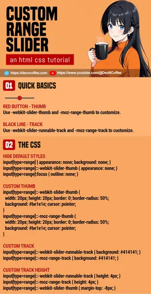
Once upon a time, a student is tasked to create a custom HTML range slider. Sounds easy enough. But just after a few minutes of research, the student foamed in the mouth and surrendered. Yes, it really isn’t straightforward. Let Master Coffee show you how, with an “as simple as possible” example.
CODE DOWNLOAD
I have released this under the MIT license, feel free to use it in your own project – Personal or commercial. Some form of credits will be nice though. 🙂
VIDEO TUTORIAL
CUSTOM RANGE SLIDER DEMO
You should see a “red button” and “black track”. Works on most modern browsers running Webkit (Chrome, Edge, Opera, Brave) and Firefox. Falls back to a “normal range slider” on non-supported browsers.
1) THE HTML & BASICS
<input type="range">- If you don’t already know… We use
<input type="range">to create range sliders. - The “red knob” is called the thumb, and the “black line” is called the track.
- At the time of writing, there are no standard CSS properties to select the thumb and track.
- For Webkit-based browsers (Chrome, Edge, Opera, Safari):
- Select the thumb with
::-webkit-slider-thumb. - Select the track with
::-webkit-slider-runnable-track.
- Select the thumb with
- For Firefox:
- Select the thumb with
::-moz-slider-thumb. - Select the track with
::-moz-range-track.
- Select the thumb with
2) HIDE THE DEFAULT STYLES
/* (PART A) HIDE DEFAULT STYLES */
input[type=range] {
  appearance: none;
  background: none;
}
input[type=range]::-webkit-slider-thumb {
  appearance: none;
}
input[type=range]:focus {
  outline: none;
}
To create a custom range slider, the first step is to hide the default styles.
input[type=range] { appearance: none; background: none; }Removes the default thumb and track.input[type=range]::-webkit-slider-thumb { appearance: none; }Required for Webkit to remove the default thumb.input[type=range]:focus { outline: none; }Optional, removes the annoying black outline when users click on the slider.
3) CUSTOMIZE THE THUMB
/* (PART B) THUMB */
input[type=range]::-webkit-slider-thumb {
  width: 20px; height: 20px;
  border: 0; border-radius: 50%;
  background: #be1e1e;
  cursor: pointer;
}
input[type=range]::-moz-range-thumb {
  width: 20px; height: 20px;
  border: 0; border-radius: 50%;
  background: #be1e1e;
  cursor: pointer;
}- You can define the dimensions and colors of the thumb “just like any other block elements”.
- Smart alecks who are thinking “Master Coffee so stupid, why not combine together” –
input[type=range]::-webkit-slider-thumb, input[type=range]::-moz-range-thumb { ... }. Feel free to try it for yourselves and see if it works. 😉
4) CUSTOMIZE THE TRACK
/* (PART C) TRACK */
input[type=range]::-webkit-slider-runnable-track {
  background: #414141;
}
input[type=range]::-moz-range-track {
  background: #414141;
}
Yep, customizing the track is as simple as setting the background color.
5) RESIZING THE TRACK
/* (PART D) TO "RESIZE" TRACK */
/* (20px - 4px) / 2 = 8 px */
input[type=range]::-webkit-slider-runnable-track {
  height: 4px;
}
input[type=range]::-moz-range-track {
  height: 4px;
}
input[type=range]::-webkit-slider-thumb {
  margin-top: -8px;
}
Lastly, customizing the height of the track is another pain.
- Start with defining the height of the track –
::-webkit-slider-runnable-track { height: 4px } ::-moz-range-track { height: 4px; } - Firefox will automatically center the track.
- But for Webkit, we have to use
margin-topto offset the track’s position. Some simple calculations are required –(HEIGHT OF THUMB - HEIGHT OF TRACK) ÷ 2.
THE END – RESIZING THE ENTIRE SLIDER
That’s all for this tutorial and sharing. One last bit before we end, for those who wants “a longer track”, “set background color”, “set spacing”, “set border”… The range slider can still be styled as it is – width height padding margin background border
CHEAT SHEET

