Once upon a time, a student loaded an entire library to do “slick animations”. Only to use it for a simple fade effect. Well, there’s no need to load an entire library if you just want to do “simple fade”… All it takes is a few lines of CSS and Javascript. Let Master Coffee show you how, let’s go!
CODE DOWNLOAD
I have released this under the MIT license, feel free to use it in your own project – Personal or commercial. Some form of credits will be nice though. 🙂
VIDEO TUTORIAL
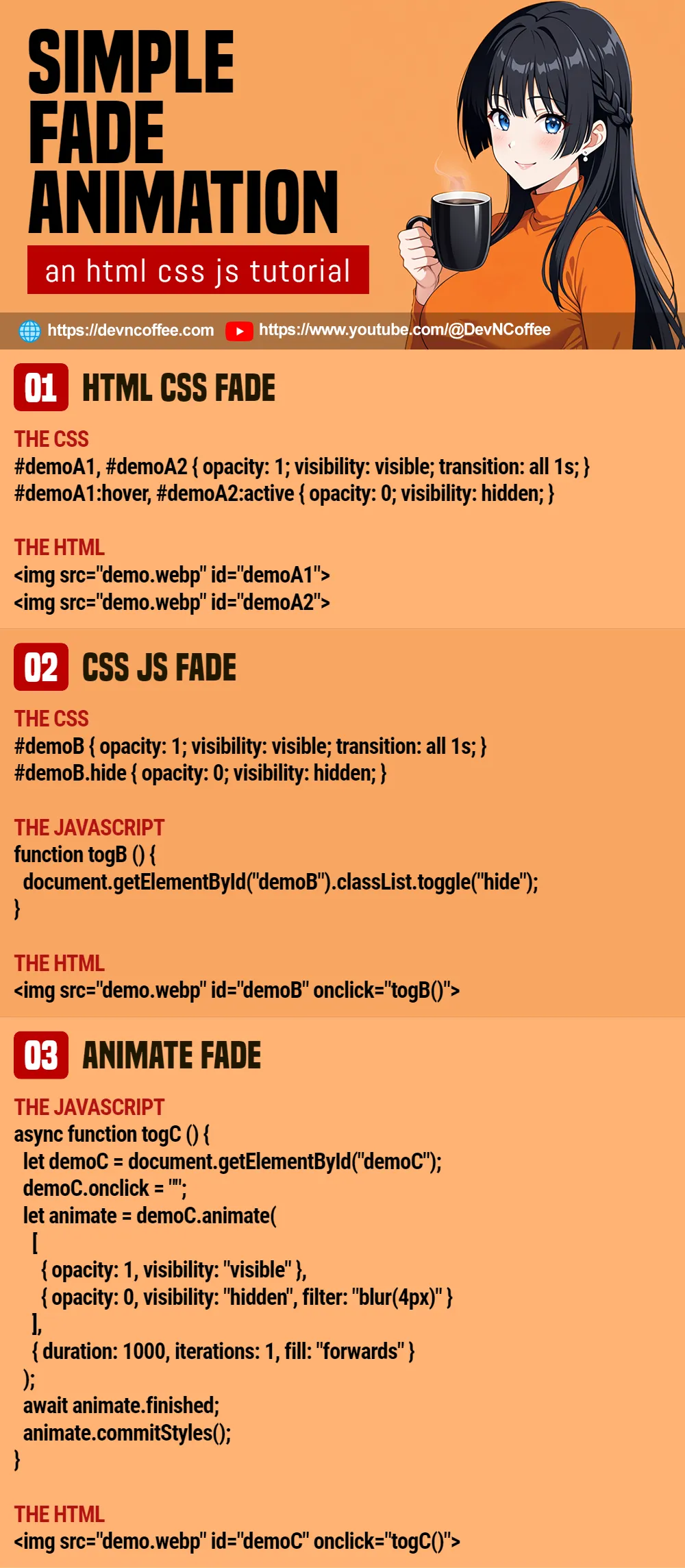
1) FADE IN & OUT WITH HTML CSS
<!-- (PART A1) THE HTML -->
<img src="demo.webp" id="demoA1">
<img src="demo.webp" id="demoA2">

<!-- (PART A2) THE CSS -->
<style>
#demoA1, #demoA2 {
  opacity: 1; visibility: visible;
  transition: all 1s;
}
#demoA1:hover, #demoA2:active {
  opacity: 0; visibility: hidden;
}
</style>
- Start by setting your container (image, text, video, whatever else) to
opacity: 1andvisibility: visible. - On mouse hover or click-and-hold, hide it with
opacity: 0andvisibility: hidden. - Very important, attach
transition: all 1s. CSS will do the fade magic automatically.
P.S. For those who are wondering why we don’t just use display: none, CSS cannot animate display. Thus, we use opacity and transition instead.
P.P.S. If you want a faster or slower animation, just change the time accordingly – transition: all 0.5s will be faster, transition: all 2s will be slower.
2) FADE WITH CSS JS
<!-- (PART B1) THE HTML -->
<img src="demo.webp" id="demoB">
<input type="button" value="Toggle" onclick="togB()">

<!-- (PART B2) THE CSS -->
<style>
#demoB {
  opacity: 1; visibility: visible;
  transition: all 1s;
}
#demoB.hide {
  opacity: 0; visibility: hidden;
}
</style>

<!-- (PART B3) THE JAVASCRIPT -->
<script>
function togB () {
  document.getElementById("demoB").classList.toggle("hide");
}
</script>
If you want to “fade on click” or “fade programmatically”, Javascript is the only way:
- As usual, start with
opacity: 1andvisibility: visible. - Create a
hideCSS class withopacity: 0andvisibility: hidden. - Use Javascript to toggle the
hideCSS class on your target container –document.getElementById("TARGET").classList.toggle("hide").
3) JAVASCRIPT ANIMATE FADE
<!-- (PART C1) THE HTML -->
<img src="demo.webp" id="demoC" onclick="togC()">

<!-- (PART C2) THE JAVASCRIPT -->
<script>
async function togC () {
  // (C2-1) GET IMAGE + CLICK ONCE ONLY
  let demoC = document.getElementById("demoC");
  demoC.onclick = "";

  // (C2-2) ANIMATE
  let animate = demoC.animate(
    [
      { opacity: 1, visibility: "visible" },
      { opacity: 0, visibility: "hidden", filter: "blur(4px)" }
    ],
    {
      duration: 1000,
      iterations: 1,
      fill: "forwards"
    }
  );

  // (C2-3) OPTIONAL - DO SOMETHING ON END
  await animate.finished;
  animate.commitStyles();
}
</script>
Lastly, we have Javascript animate() that can do all kinds of animations programmatically.
- It takes in 2 parameters –
ELEMENT.animate(KEYFRAMES, OPTIONS). - As you can see,
KEYFRAMESis the same old start withopacity: 1and end withopacity: 0. - Also,
OPTIONSare self-explanatory. How fast/slow you want the animation, and loop how many times. - Take note of
fill: "forwards"andanimate.commitStyles()on animation end here –animate()will revert to a fully visible image if both of these are not defined.
TLDR – Use animate() if you want “fine controls” over the animations in Javascript.
THE END – COLLAPSE CONTAINER AFTER FADE
That’s all for this short tutorial and sharing, one last mini extra before we end. If you want to do something before or after the transition end, just attach an event listener:
ELEMENT.addEventListener("transitionstart", () => { DO SOMETHING });ELEMENT.addEventListener("transitionend", () => { DO SOMETHING });
CHEAT SHEET