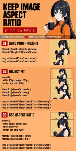
Once upon a time, a student had to keep the aspect ratio of an image. He did all kinds of crazy “wrap image in many containers” and even used Javascript to “recalculate the image dimensions on window resize”… Well, there are simpler ways in modern CSS. Let Master Coffee show you how, let’s go.
CODE DOWNLOAD
I have released this under the MIT license, feel free to use it in your own project – Personal or commercial. Some form of credits will be nice though. 🙂
VIDEO TUTORIAL
1) AUTO WIDTH/HEIGHT
<!-- (PART A) AUTO WIDTH/HEIGHT -->
<style>
#demoA1 { width: 500px; height: auto; }
#demoA2 { height: 200px; width: auto; }
</style>
<img id="demoA1" src="demo.webp">
<img id="demoA2" src="demo.webp">

- Set the width as required, then the height to auto.
- Vice versa – Set the height as required, and the width to auto.
Yes, that simple. The browser will automatically calculate and resize the image for you. While maintaining the aspect ratio.
2) OBJECT FIT
<!-- (PART B) OBJECT FIT -->
<style>
.demoB {
  width: 450px; height: 200px;
  border: 1px solid #000;
}
#demoB1 { object-fit: contain; }
#demoB2 { object-fit: cover; }
#demoB3 { object-fit: none; }
</style>
<img id="demoB1" class="demoB" src="demo.webp">
<img id="demoB2" class="demoB" src="demo.webp">
<img id="demoB3" class="demoB" src="demo.webp">


If you have “very specific dimensions” to keep, use object fit to help you resize the image accordingly.
containThe image will be scaled to fit inside the box. Take note, you may end up with empty spacing around the box.coverThe image will be scaled to fit the entire box.noneThe image will not be scaled. That is, it will be placed inside the box as it is. Same as contain, you may get empty spacing if the box is bigger than the image.
3) ASPECT RATIO
<!-- (PART C) CSS ASPECT RATIO -->
<style>
.demoC {
  width: 450px; height: auto;
  object-fit: cover;
  border: 1px solid #000;
}
#demoC1 { aspect-ratio: 16/5; }
#demoC2 { aspect-ratio: 4/3; }
</style>
<img id="demoC1" class="demoC" src="demo.webp">
<img id="demoC2" class="demoC" src="demo.webp">

The modern CSS convenience, aspect ratio.
- Yes, just set the
aspect-ratioand that’s all. - It is optional to set/limit the dimensions with
width max-width min-width. - Lastly, remember to define
object-fiton how to rescale the image to fit.
4) PADDING TRICK
<!-- (PART D) PADDING TRICK -->
<style>
#demoD1 { max-width: 600px; }
#demoD2 {
  background: url(demo.webp) no-repeat center center;
  background-size: cover;
  /* 16:9 RATIO = 9/16 = 0.5625 */
  width: 100%; height: 0; overflow: hidden;
  padding-top: 56.25%;
  border: 1px solid red;
}
</style>
<div id="demoD1">
  <div id="demoD2"></div>
</div>
This is an old school method that I do not recommend… I am keeping this here just for those who may have to support the ancient browsers.
- Start by creating a pair of nested
<div>. - Use the outer container is to set the dimensions –
width max-width min-width. - Set the image as the background for the inner container, set it to
width: 100%,height: 0,overflow: hidden. - Lastly, use
padding-topto maintain the aspect ratio. That is:padding-topis relavant to thewidth.padding-top: 50%will have a height that is half of the current width, an aspect rato of2:1.- So for an aspect ratio of
16:9, we will need a padding of9 / 16 = 56.25%.
THE END – HOW ABOUT BACKGROUND IMAGES?
That’s all for this short tutorial and sharing. But how about background images? Well, the above CSS aspect ratio can be applied to all block elements. But getting a background image to fill an entire container is a little tricky – Check out my responsive background images tutorial if you need more examples.
CHEAT SHEET

