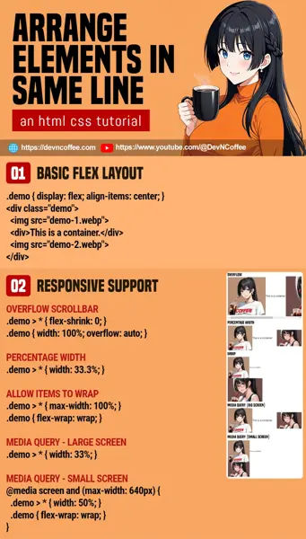
Once upon a time, a student wanted to lay some pictures and text in a “nice single line”. She then looked all over the Internet, found many different ways and crazy guides. Well, let Master Coffee show you the simplest way – Just set the container to display: flex. That’s all. Let us walk through some simple examples if you need.
CODE DOWNLOAD
I have released this under the MIT license, feel free to use it in your own project – Personal or commercial. Some form of credits will be nice though. 🙂
VIDEO TUTORIAL
PART 1) FLEX LAYOUT
<div class="demo">
  <img src="demo-1.webp">
  <div>This is a container.</div>
  <img src="demo-2.webp">
</div>/* (PART A) FLEX LAYOUT */
.demo {
display: flex;
align-items: center; /* vertical center */
/* justify-content: center; /* horizontal center */
}

- As in the introduction, all you need is to set the container to flex layout –
display: flex - Optionally, set
align-items: centerto vertically align all the items in the center. - Lastly, also set
justify-content: centerto horizontally align the items in the center.
PART 2) RESPONSIVE DESIGN
2A) OVERFLOW SCROLLBAR
.demo > * { flex-shrink: 0; }
.demo { width: 100%; overflow: auto; }


Setting the container to flex layout will pretty much achieve “align items in a single row”, but there’s one thing you need to deal with in this age – Responsive design, to support the small mobile screens. No need to worry, it’s actually pretty simple. Here is the first common solution:
.demo > * { flex-shrink: 0; }Don’t shrink the items. Display them as they are..demo { width: 100%; overflow: auto; }Allow the container to display a scrollbar if the items are wider than the width of the window.
2B) PERCENTAGE WIDTH
.demo > * { width: 33.3%; }

Alternative number two. There are 3 items in the container, so to space them apart equally – 100% ÷ 3 = width: 33.3%.
2C) WRAP ITEMS INTO NEW ROWS
.demo > * { max-width: 100%; }
.demo { flex-wrap: wrap; }

- Allow the items to break into new rows with
flex-wrap: wrap. - Limit the items with
max-width: 100%so they are not wider than the container.
I know this is not “a single line” anymore, but you decide on your own design. Is it better to show the items properly on small screen portrait mode? Or you MUST squeeze all of them into a single row regardless of screen size?
2D) MEDIA QUERY
/* (PART A) LARGE SCREENS - 3 EQUAL ITEMS IN A ROW */
.demo > * { width: 33%; }

/* (PART B) SMALL SCREENS - 2 ITEMS PER ROW */
@media screen and (max-width: 640px) {
  .demo > * { width: 50%; }
  .demo { flex-wrap: wrap; }
}

Lastly, you can say this is kind of a “compromise”.
- On big screens, it is still 3 items in a single row
width: 33.3%. - But on small screens, it turns into 2 items per row
width: 50%and they are allowed to wrap into new rowsflex-wrap: wrap.
THE END – OTHER WAYS TO “KEEP ELEMENTS IN SINGLE LINE”
That’s all for this short tutorial and sharing. Of course, flex layout is not the only solution. For those who are curious and want to explore other possibilities, I will just leave these here:
- Grid layout –
.demo { display: grid; grid-template-columns: repeat(3, minmax(0, 1fr)); } - Display as table –
.demo { display: table; }and.demo > * { display: table-cell; } - Inline block –
.demo > * { display: inline-block; max-width: 33%; } - Float –
.demo > * { float: left; max-width: 33%; }
CHEAT SHEET

