Once upon a time in the Stone Age of the Internet, Master Coffee had to create circles using images and all kinds of “funny hacks”. But now, it is so easy with modern CSS. Let’s walk through some simple examples, let’s go!
CODE DOWNLOAD
I have released this under the MIT license, feel free to use it in your own project – Personal or commercial. Some form of credits will be nice though. 🙂
VIDEO TUTORIAL
PART 1) BASIC CIRCLE
<style>
.circle {
  width: 150px; height: 150px;
  border-radius: 50%;
  background: red;
}
</style>

<div class="circle"></div>
Let us start with a “basic static circle”, so the total beginners can better understand the mechanics.
width: 150px; height: 150px;Set equal width and height to create a square.border-radius: 50%;Turns the square into a circle with 50% border radius.background: COLORThat’s all. Set the circle to whatever color you like.
PART 2) RESPONSIVE CIRCLE
<style>
.circleR {
  width: 30%; max-width: 300px;
  aspect-ratio: 1/1; border-radius: 50%;
  background: green;
}
</style>

<div class="circleR"></div>
To turn the “static circle” into a “responsive circle”, we need some small changes:
width: 30%;For the circle to “resize automatically”, we set a percentage width.- Take note, setting
height: 30%will NOT create a square here. For those who are lost, let’s just take full HD 1920 X 1080 as example.- 30% width is
30% X 1920 = 576. - 30% height is
30% X 1080 = 324. - So… Unless you put the circle in a square window or another square container, a percentage height is not a good solution.
- 30% width is
aspect-ratio: 1/1;Thankfully, modern CSS has a very simple solution – Just set a 1:1 aspect ratio to create a square.border-radius: 50%;As usual, this turns the square into circle.max-width: 300px;Optional, limits how much the circle can grow.- You can also set a
min-widthif you want.
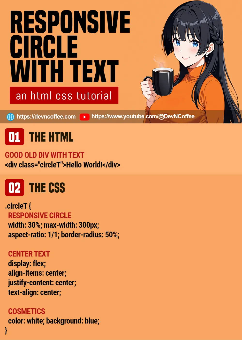
PART 3) RESPONSIVE CIRCLE WITH TEXT
 <style>
.circleT {
  /* (PART A) RESPONSIVE CIRCLE */
  width: 30%; max-width: 300px;
  aspect-ratio: 1/1; border-radius: 50%;

  /* (PART B) CENTER TEXT */
  display: flex;
  align-items: center;
  justify-content: center;
  text-align: center;

  /* (PART C) COSMETICS */
  color: white; background: blue;
}
</style>

<div class="circleT">Hello World!</div>Finally, just add some text into the circle. We also need to add some CSS to center the text.
display: flexSet the container to flex layout.align-items: centerVertically center the text block in the circle.justify-content: centerHorizontally center the text block in the circle.text-align: centerYou should know this.
THE END – LIMITED TEXT
That’s all for this short tutorial and sharing. Before we end, here’s a quick reminder – We can still set the padding margin font-size on the circle as usual. A small circle can only take a few words before it becomes funky… Plan your font, font size, and text carefully.
CHEAT SHEET